 Printing experts since 1902
 Family business, modern technology
 Free supportive design servicePrinting experts since 1902Family business, modern technologyFree supportive design service
Call us on 01424 420919 or email sales@judges.co.uk
Printing experts since 1902Family business, modern technologyFree supportive design servicePrinting experts since 1902Family business, modern technologyFree supportive design service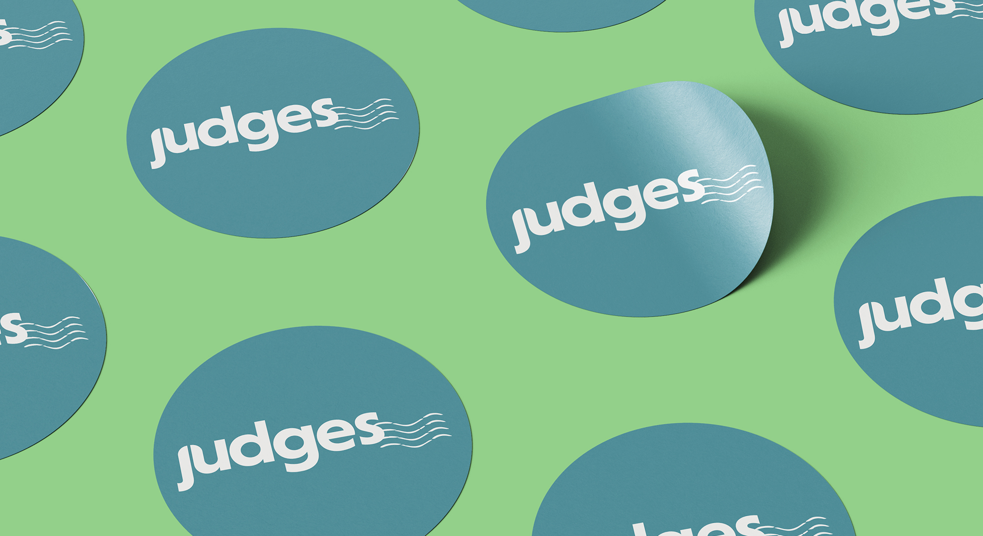
After 120 years of selling postcards, gifts and souvenirs to tourism retailers across the UK, we decided it was time to refresh our brand for 2022. Not only to bring us up to date with the ever-changing market but to follow our core values and represent the innovation we continue to promote in our business.
Naturally, the word rebrand can be a scary one. Your brand is the physical asset representing your position in the market. So, the step toward change can feel daunting. For long-standing companies, like Judges, the original spark in your identity can falter. Between providing quality products, customer-centric services, and company growth, it’s easy to lose sight of an identity.
Why did we rebrand?
Earlier this year, we decided it was time for a change. Fred Judge founded Judges in Hastings in 1902. Since then, it has seen extensive technological and cultural innovations. Our branding must represent growth and fluidity as we move to the future. Alongside our well-established traditions of designing and manufacturing gifts and souvenirs for a variety of sectors across the UK and internationally.
As a general rule, if you’re rebranding, there must be a reason. Ours was to refine Judges' identity, encapsulating our creativity and design by producing high-quality products. We want Fred’s ethos and our values present across the brand. From talking to prospects and customers to social media and website interactions to team culture.
Our core values are the centre of everything we do: Family, People, Tradition, Innovation and Sustainability. As we continue to transition and evolve, it's crucial for us to have a brand and logo that aligns with this.
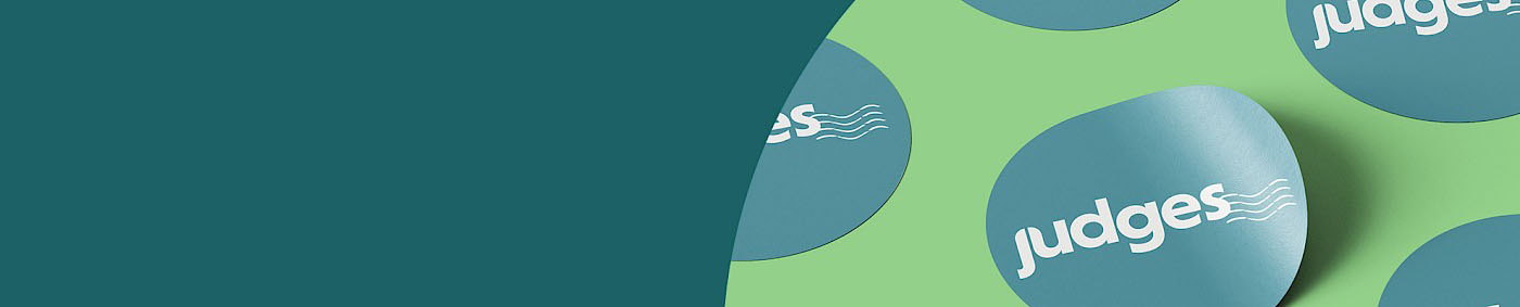
What’s the story behind the new logo?
We wanted our logo to capture our founding roots and coastal, seaside location. To illustrate our traditions while keeping up-to-date with current trends and meeting the expectations of our customer base.
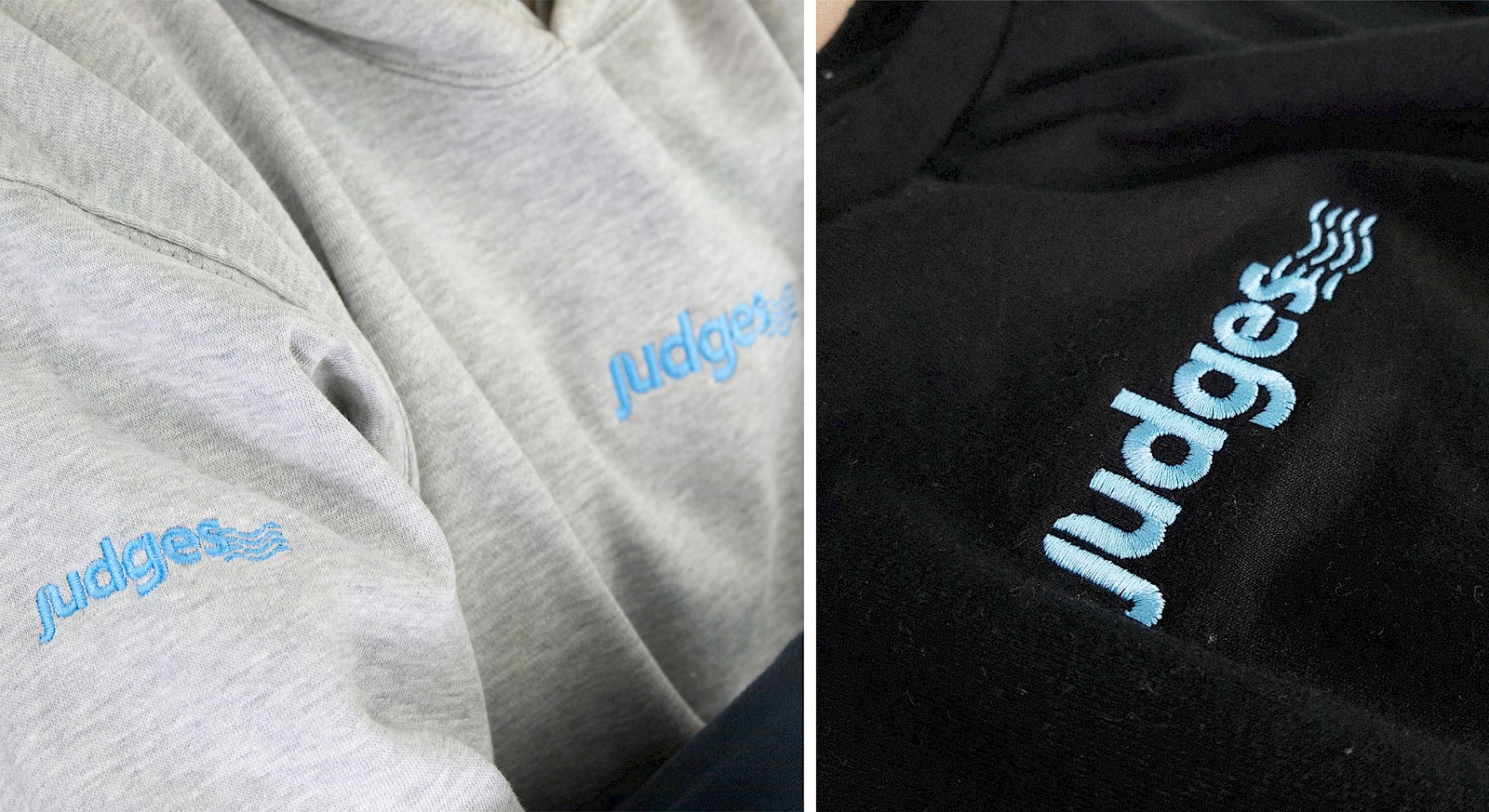
In creating the new logo font, we wanted a more impactful design than we had previously. A logo design that stands out, feels friendly and doesn’t get lost on our products. The letters have a neat, simplistic flow, giving a more contemporary, less corporate, look.
Trading a harsh, corporate red for a lighter blue adds a calmness and modernity while still integrating our home by the sea. When choosing our secondary colours, we wanted something related to the heritage, tourism and charity sectors we collaborate alongside. The best colours to go with were cream and dark teal, which complemented the freshness of the lighter blue. The green represents our efforts to be more sustainable as a company. Our brand colours reflect our history and elements that bring Judges together while aligning with the market and our customers.
The connected J and U joining create an arch at the top which reflects the window arches on our building. They symbolise the Italianate architecture and the inherited beauty of the “old” Judges combined with the future innovative growth we can achieve. The franking stamp effect takes a component of our beginnings selling picture postcards with the waves depicting our seaside location. Waves represent the continued movement as a business – we’re never static. We're consistently adapting with time while remembering our roots.
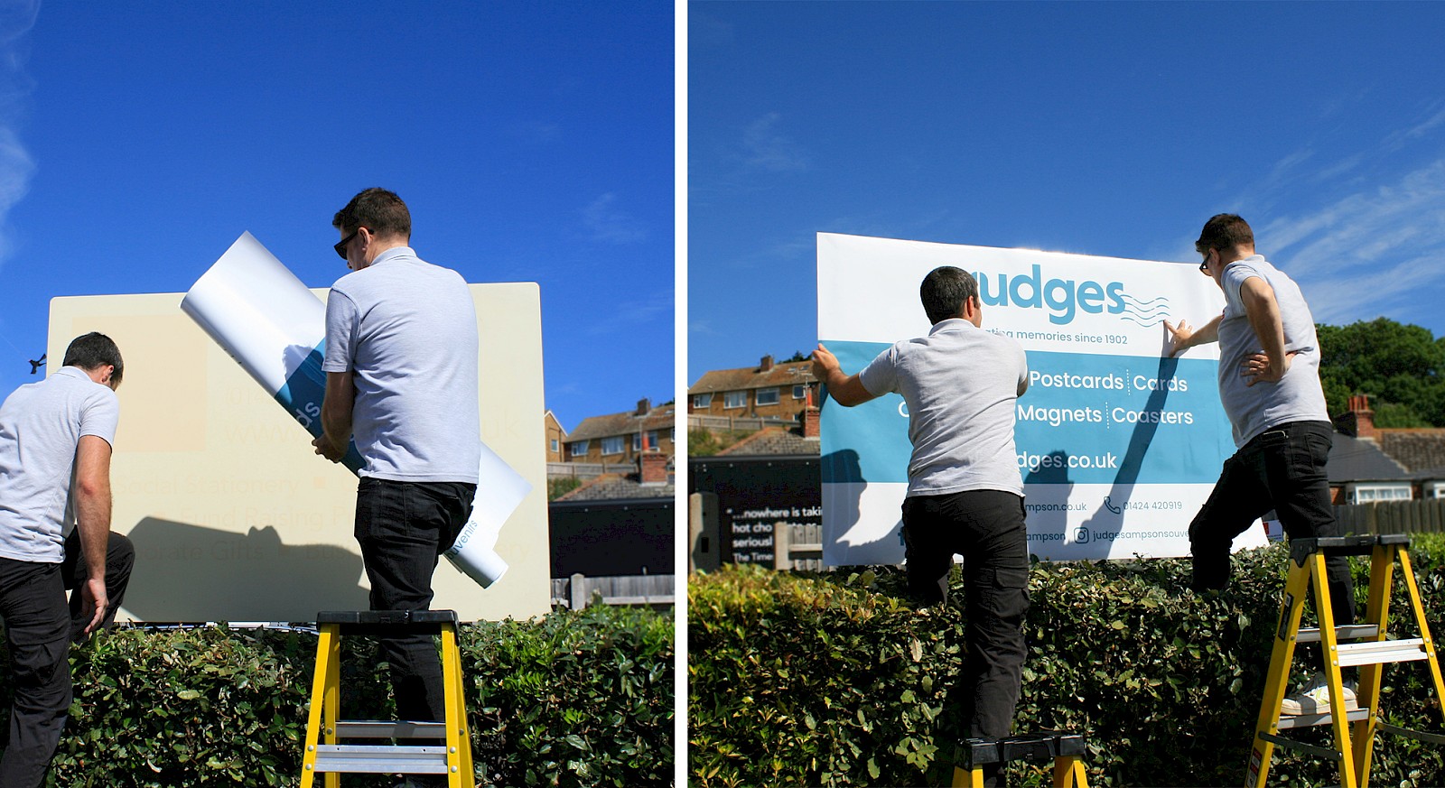
So, welcome to the new Judges! As we move forward with our new identity, we're excited to see what we can accomplish as a collective, with our team, and with our customers.
If you would like to learn more about our products and services, get in touch and our team will be happy to tell you more about what we can do for you.
While you’re here, why not browse our new ‘Design Collections’ or existing ‘Products’.
Copyright Judge Sampson Limited © 2026. Manage Cookies. Website by Warp Design
You have items in your quote. Would you like to review them before leaving?
View My Quote